Jun 14, 2017 | Gallery, Hand-Crafted Cards |

Welcome to the June 2017 Pals Blog Hop. Thank you so much for joining us today. This month’s theme, Pick a “B”, features projects inspired by Babies, Birthdays and Brides to name few. You may just get a glimpse of new catalog products while you hop with us today.
Whether you’re just starting the hop, or have come from a previous Pal’s blog, you’ll find the line-up toward the end of my post to help you move along.
Since beginning this blog just one month ago, I’ve been looking forward to my first Pals Blog Hop. I always enjoy seeing everyone’s creations, so being able to participate is thrilling! This month’s theme is the letter “B,” and I chose “Birthday.”

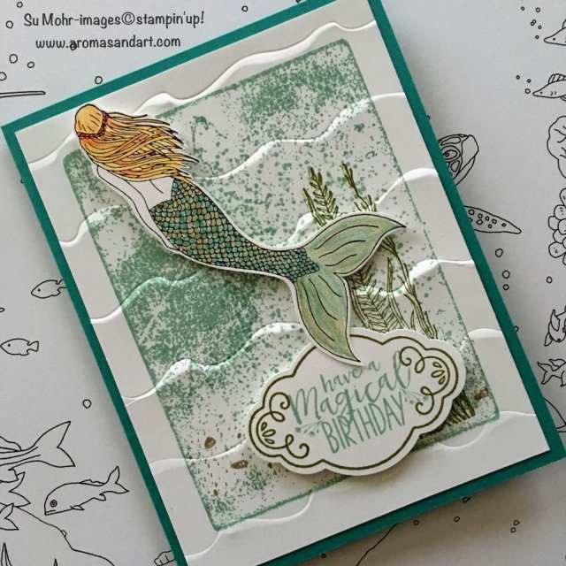
This graceful mermaid caught my eye the first time I scanned the catalog at OnStage. I thought she would be fairly easy to fussy cut, and with the exception of her hair, she was. I stamped her in Chocolate Chip on Thick Whisper White cardstock, because I wanted her to be sturdy on top of dimensionals. Next, on to the coloring…
I used our watercolor pencils without adding water. Her hair is Daffodil Delight and Pumpkin Pie with a band of Real Red, and her tail is Old Olive and Bermuda Bay. Do you see the Clear Acrylic Block E in the picture? That’s what I inked with the color Pool Party for the frame. There wasn’t quite enough color, so I added more with the dotted stamp in the set. I also used the sand and seashell stamp along the bottom in Sahara Sand, and the seaweed stamp in Old Olive.

Before gluing the art piece to the Bermuda Bay card base, I wanted to add ocean waves. I had experimented with our new Ruffled embossing folder, so I knew it would create just the look I wanted. Only, it turned out better than I thought it would! And, the sentiment, “have a Magical Birthday,” fit perfectly in our new Label Punch with the added stamped decoration around it from the Label Me Pretty stamp set. If you happened to notice, this card is photographed on our new Designer Series Paper, Just Add Color. A sea turtle is peeking from beneath this card, but will soon take center stage. My grandson loves sea turtles, so I’ll be sending one to him.
Thanks again for hopping with the Stampin’ Pretty Pals today. Take a minute to mark your calendar for our next hop on July 12. We’re having a pattern party! Now hop along using the Blog Hop Line-up below. See you on July 12 for the next Pals Blog Hop!

Blog Hop Line-up:
- Mary Fish at Stampin’ Pretty
- Rae Harper-Burnet at Wild West Paper Arts
- Stesha Bloodhart at Stampin’ Hoot!
- Lynn Tague at Beyond Beaches & Blessings
- Tricia Chuba at ButterDish Designs
- Nicole Watt at Pixel Maven’s Retreat
- Jennifer Michalski at Stamping Serenity
- Julie DiMatteo at The Paper Pixie
- Mary Hanson at Up North Stampin’
- Peggy Noe at Prettypapercards
- Patti MacLeith at Papercrafts by Patti
- Kim Jolley at Stampin’ Artfully
- Jackie Beers at Blue Line Stamping
- Rosanne Mulhern at Heartfelt Stamping
- Karen Hallam at Karen’s Stampin’ Habit!
- Beth McCullough at Stamping Mom
- Lisa Ann Bernard at Queen B Creations
- Jeanie Stark at Just Stampin’
- Amy Hoptay at Craft Carnivore
- Pamela Sadler at Stampin Pink Rose
- Susan Itell at Simple Stampin’
- Wendy Klein at Doggone Delightful Stampin’
- Becky Retzer at Just in Thyme
- Sherrie Gross at Stampin’ Sunshine
- Sara Hicks Stuart at Sentiments by Sara
- Rachael Shedeed at Bluebonnet Stampin’
- Su Mohr at Aromas and Art<<<<<<< YOU ARE HERE!!
Jun 13, 2017 | Gallery, Hand-Crafted Cards |
Father’s Day is just around the corner, and this week’s Global Design Project 091, “Wheels,” would tie in perfectly.

This card would be for a bike riding dad, so I began with the bicycle-built-for-two from the Pedal Pushers stamp set. The sentiment, “Best. Guy. Ever.” is from the Suite Sentiments stamp set, and the hearts are die cut from Love Notes Framelits Dies. If you have the 2017-2018 Stampin’ Up! catalog, you might recognize that these items are from the previous catalog. It delights me to show that with some current Designer Series Paper, you get a brand new look.
The sentiment and bicycle were stamped and layered on Wood Textures Designer Series Paper. I thought this would add a rustic, masculine feel. Since wheels are round, the design of this sheet from the Coffee Break DSP would be my choice. The fabulous color combo of this paper determined the colors for my card. It would have a Soft Sky card base layered with Garden Green, a Garden Green Layering Square, and the hearts would be Soft Sky and Pear Pizazz. For the final detail, I tied the sentiment with Baker’s Twine and love.
Jun 12, 2017 | Gallery, Hand-Crafted Cards |
I had no idea where Stampin’ Up would take me when I signed up as a demonstrator November 2015. I hadn’t realized the creativity that was missing in my life. Nor did I expect to gain so many new, fabulous friends. There is so much inspiration among my friends, and I can’t resist the challenges. So, here I am, submitting my post for the opportunity to be selected as a display demonstrator at OnStage in Salt Lake City. I humbly appreciate your consideration.
For the three card fronts, I chose a post from the blog I began in May:
I can hardly recall the days before Pinterest. Pinning the cards I create to one of my boards has become an obsession. I know my Stampin’Up Pals can relate, because I see many of your beautiful projects displayed there. Are you curious which ones will become the most popular? I enjoy making others happy when they see my cards, so I allow Pinterest to notify me when one of my cards is pinned. I haven’t made an official count, but have a good idea of the most popular ones. All are prior to the beginning of my blog, Aromas and Art, so you will find descriptions of them in my Gallery under Idea Board.
The most recent three are all from the Colorful Seasons Bundle. I think this will be one of Stampin’Ups winning bundles. Everyone seems to adore the Adirondack chair. This first one also shows the fabulous Delightful Daisy Designer Series Paper.

The second one uses that same wonderful chair, but with retiring colors and elements from Beautiful Branches. I just love that tree and little bird, and have used them on many cards. I have a supply of Tip Top Taupe, Mint Macaron and Watermelon Wonder as well, so I’ll continue using these colors.

The third one shows off the branch and blossoms against the Woodland embossing folder, and the new color Tranquil Tide. The sentiments are just beautiful in this set; the words and the font. No wonder this bundle makes popular cards!

The first 3D project I selected is from Dragonfly Dreams, which I was delighted to see in the new annual catalog.

The second is our beautiful Window Box, perfect for small gifts.

For my scrapbooking page, I chose one of my favorite stamp sets to highlight the page, Magical Mermaid. It’s perfect for a young girl’s birthday. I also figured it was a good way to make use of (and preserve) some of my favorite cards. It just happens to match the Window Box. Amazing how Stampin’ Up! makes that happen!

Thank you for your time, and I hope to meet you in November!
Jun 9, 2017 | Gallery, Hand-Crafted Cards |
We have a new stamp bundle named “Oh So Eclectic.” So, what’s eclectic mean, anyway? I learned the meaning in an interior design class in college, but Siri refreshed my memory: “deriving ideas, style or taste from a broad range of sources.” Some samples from this bundle are showcased on the cover of the catalog, and it was at the top of my list when it came time to order. The elements were so pretty, and I couldn’t wait to try different color combinations.

I decided to try toning down the look by using just four colors. Tempting Turquoise is the card base, which was layered with Whisper White, and then another layer of the Tempting Turquoise. The Eclectic Layers die made a fabulous pattern on the left panel, and I decided to leave the right side plain to let the flowers stand out. Isn’t this flower fabulous? Whisper White, Lemon Lime Twist, and Bermuda Bay are the three colors I used. I’m always needing birthday cards, and I found the right size “Happy Birthday in the At Home With You stamp set. It needed to fit within the Classic Punch, so it could mimic the points of the die cut panel.

How did I decide the design lay-out of this card? With the help of this week’s Case this Sketch #225. How did I do?

I have a feeling the Oh So Eclectic will become one of my favorite stamp sets. I can’t wait to see all of the cards on the Pinterest boards!

Thanks for stopping by!
Jun 8, 2017 | Gallery, Hand-Crafted Cards |
A new challenge, oh boy! I’d been hearing talk about this “Tic Tac Toe” challenge, and was excited to see how I could use one of my new stamp sets within the rules of the game. I chose the middle row down, which meant I had to use a circle, free choice, and white. The idea I had for a baby card from A Little Wild Bundle would work perfectly.

I chose the elephant, (the set also has a lion and a bear) and stamped him in Basic Black on Smoky Slate. The die that comes in the bundle cut him out perfectly. I just had to fold him and cut the tag hole from his head. The animals were designed as tags for baby gifts, and would be so cute used this way. But, this elephant had other plans, which included spinning to show his backside. 
I began with a Blushing Bride card base, layered with grey dotted Designer Series Paper. A Layering Circle Die was used to cut a hole that would accommodate the elephant, and I wanted this framed. Hmmm, what would I use? The Sheet Music stamp! Lullabies and babies go together, so the musical notes made sense to me. The Wonderful Wreath die gave this circle an interesting edge, and it was tied at the top with grey and white Baker’s Twine. My husband was curious why I needed fishing line, but he kindly brought it to me from the garage. This was fastened down the middle of the elephant and to the top and bottom of the card base with tear tape prior to framing. The sentiment, “a great big welcome for a sweet little someone,” was stamped on a circle of the Sheet Music. I added some Fresh Florals Designer Series Paper to the inside, but left enough white space for a note from the giver.

It’s hard to appreciate this little fella without seeing him in person. He may get worn out with all of the spinning I’m giving him. Thank you to Tic Tac Toe for the inspiration, and especially Peggy Noe, for being this first week’s designer!
Jun 6, 2017 | Gallery, Hand-Crafted Cards |
It is now June 6th, and six days since I was able to place my order from the new Stampin’ Up! 2017-2018 Catalog. I’ve looked at its 233 pages so many times, it’s practically memorized. (There’s a digital copy on the homepage of my blog, in case you haven’t seen it.) The box arrived earlier in the day than expected, which was a delightful surprise.
One by one, I lifted the contents from the box, and spread them out across the bed in my craft room. I actually made a video describing the contents, and posted it on Facebook to a group who would totally understand my obsession. The quality of the video is poor, because it’s really difficult to hold a phone camera while using both hands at the same time. So, unless you ask for it, you will be spared. I’ve had quite a while to think about the first card I would make with my new goodies. Can you see the Lemon Builder Punch in the lower left-hand corner? That’s it! Page 90! That would be my first project.
This week’s sketch from Global Design Project #090 gave me direction for the lay-out, and I knew I wanted to use the colors of yellow and green.
I began with a card base of Daffodil Delight, and I stamped a lemon from the Lemon Zest stamp set using that same color ink, and punched it out. How fun! The leaves for the lemon were stamped using Old Olive, and punched. I wanted the lemon to have extra body, so I punched a second lemon, and glued the leaves between the two. The sentiments in this set are fantastic, and “Squeeze it for all it’s worth!” fit perfectly on the lemon. “Life’s Short” had to find a place, and it was stamped on a slice of lime. A Layering Circle die was used for cutting to its exact size. As exciting as the fruit is, this new embossing folder, Layered Leaves, might steal the show. Pear Pizazz was chosen as the color to emboss for the art piece, and it rolled out of the Big Shot with the most beautiful impression of leaves. This was layered on Whisper White, and made the perfect background for the citrus fruit.

Before the fruit was popped up on dimensionals, the last detail of the sketch needed to be added. The lemon needed to “hang on by a thread,” Linen Thread, that is!